

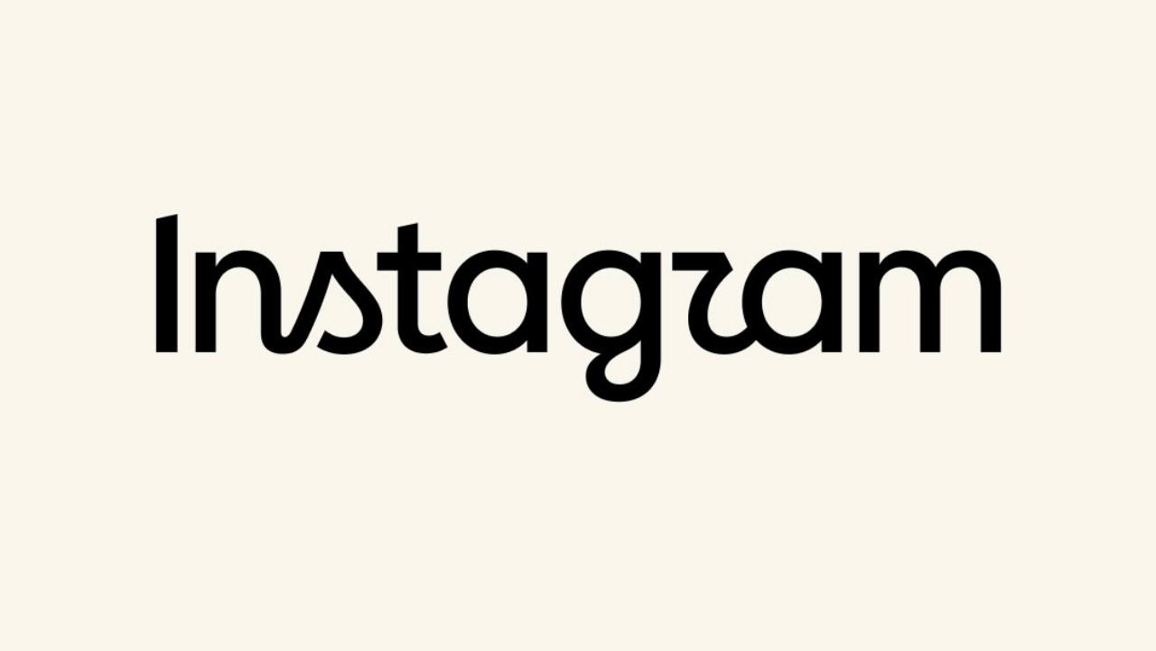
Instagram has changed its letter logo to a more concise handwritten style, but netizens are not reading it as Instagram; instead, they see it as Instagzam.
Instagram launched a new wordmark, its first letter logo update in 10 years, aiming for a more modern look.
Adam Mosseri, Instagram's head of product, revealed that the letter logo emphasizes cleanliness and modernity while still connecting to the original design’s simplicity and Instagram’s distinctive identity.
However, upon the letter logo’s release, many users mocked that it doesn’t read as Instagram but rather looks like Instagzam, because the letter 'r' resembles a 'z'; some even read it as Instagwam.
The font used in the letter logo feels like continuous handwriting with retro curves on the letters 's' and 'r', making it somewhat hard to read, though it has also been praised for its freshness.
At the same time, Meta’s press information announced updates to fonts including Instagram Sans, the handwritten Instagram Pen, and the monospaced Instagram Mono.
What remains unchanged is the app icon, which still features the pink-orange gradient introduced in 2016, replacing the original brown camera logo and rainbow stripe.