Color is not merely something seen but is a strategic communication tool. It connects brands with consumers' emotions.
In the marketing world, "color" is the first body language a brand uses to communicate with consumers, even before they read the brand name or see the logo. The relationship between a brand's signature color and color trends is like roots and flowers that must grow together.

A brand's color is chosen to reflect the business's personality and values and usually does not change often to build recognition. It is mostly used to create trust, consistency, and long-term loyalty. For example, Coca-Cola’s red conveys energy and happiness, while Facebook’s blue signals reliability and connection.
Color trends also reflect the collective mood of society at a given time. For instance, 2025-2026 emphasizes natural tones like Mocha Mousse or clean whites like Cloud Dancer to symbolize sustainability and calmness. Each year, the architectural paint industry eagerly awaits new color trend announcements from TOA Paint (Thailand) Public Company Limited, or TOA, the market leader in architectural paints in Thailand.
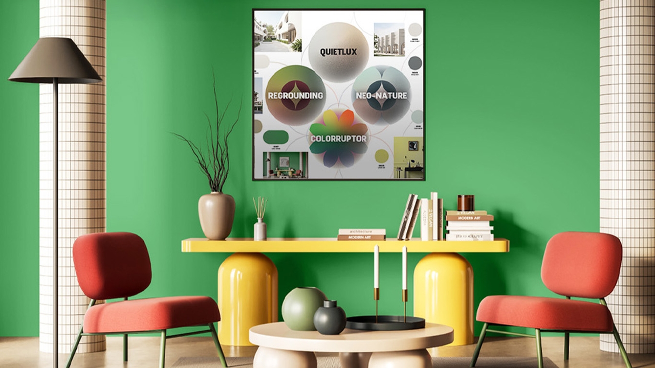
For 2026, TOA has moved beyond just 'shades' to creating energy and inspiration for life under the innovative concept called “The Pigmentum,” featuring four color trend groups that reflect the power of emotions, thoughts, and spirit, developed in collaboration with five leading architects and designers.

under the concept “The Pigmentum.” The term combines “Pigment” (color) and “Momentum” (driving force), reflecting the inner power of humans that pushes growth and steady progress.
TOA COLOR TRENDS 2026 is more than a trend; it is about awakening calm inner power to confidently move forward by expressing the strength of emotions, thoughts, and spirit, allowing everyone to discover their own energy through color shades.
The credibility of this color trend is elevated through collaboration with leading Thai architects and designers who understand 'the meaning of life' through spatial design and inspiring creations that generate new color trends.
These include Sarayut Prasertwitthayakarn, architect and managing director of Atelier of Architects; Mesa Noppakun and Poomsak Thienkaprasit, founders of Dot Line Plane and self-described “Life Creators”; Ekapap Duangkaew, founder of EKAR Architects; Natthaphon Techopich, founder and managing director of Looklen Architects; and Dulyapol Srichan, founder and managing director of the creative business PDM (Product Design Matters), which centers design as its core.
This collaboration distilled the color trends into four main groups ready to transform your home into a space of balanced and creative energy, consisting of:
1. QUIETLUX – Effortless elegance (Quiet Luxury) features simple yet powerful shades emphasizing understated sophistication. This palette represents spaces that feel relaxing while maintaining tastefulness and stability, such as Mushroom White and Light Caramel.
2. REGROUNDING – Returning to the roots of balance, this trend invites us to pause, reflect, and “be present” to find true equilibrium amid life's chaos. These shades evoke stability, earthiness, and sincerity, such as Whale Grey and Old Brick.
3. NEO-NATURE – A harmony of nature and innovation, blending natural beauty and balance with technological progress. It creates refreshing, lively spaces that retain modern function and efficiency, with colors like Thai Herb and Forest Treasure.
4. COLORRUPTOR – Colors of transformation for the bold who unleash their power and express a daring identity. Reflecting confidence ready to challenge norms, this palette inspires and energizes communities with vibrant shades like Lemon Gate and Orange Pulse.
TOA COLOR TRENDS 2026 – The Pigmentum is more than just introducing color shades; it uses 'color' to drive feelings, growth, and the world forward beautifully.
Moreover, in the marketing arena, “color” does not only serve aesthetic purposes but is the most powerful strategic tool for creating first impressions and lasting recognition. TOA’s announcement of the “The Pigmentum” color trend for 2026 is not merely about presenting new shades but provides "communication tools" for homeowners and businesses to tune their spaces to the world’s rhythm and modern consumers’ emotions, ultimately winning their hearts.
Follow marketing news with Thairath Money at
Follow the Facebook page Thairath Money at this linkhttps://www.facebook.com/ThairathMoney