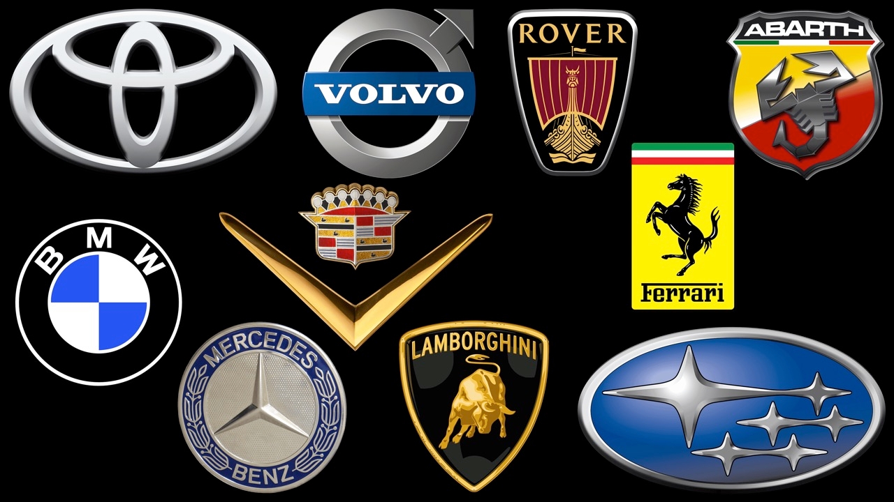
In the automotive world, brand logos are more than just memorable designs. They express the brand’s philosophy and heritage—from Mercedes-Benz’s three-pointed star or Toyota’s instantly recognizable three ovals to Lamborghini’s powerful charging bull. Automotive brand emblems reflect the vision, values, and legacy of their creators, sparking imagination and emotion, building identity and trust.
World-famous car brands do more than just produce vehicles for human mobility; they build reputations through memorable logos. To this day, unveiling a new emblem or making slight logo changes becomes global news. In truth, the badge on the hood is not merely a brand symbol but an expression of identity, emotional values, and trust built over centuries.
Popular car logos are deeply ingrained in human mobility culture, linking mechanical travel with varied attributes. Mercedes-Benz’s three-pointed star signals luxury and engineering excellence. BMW’s blue-and-white propeller emblem tells the story of its aviation origins. Ferrari’s prancing horse conveys fierce performance and Italian passion for machinery. These emotional connections make automotive logos inherently powerful marketing tools.

Rolls-Royce: The Spirit of Ecstasy
No automotive logo is more revered than Rolls-Royce’s "Spirit of Ecstasy," nicknamed the "Flying Lady." Crafted from sterling silver, crystal, or even white gold, this elegant figure graces every Rolls-Royce. Born in the early 20th century, the emblem has changed little since its 1911 design by Charles Robinson Sykes, modeled after Eleanor Thornton. It symbolizes speed, grace, and quiet dignity—qualities Rolls-Royce proudly offers its elite clientele. The flowing cloak appears wind-swept, with a balanced, forward-reaching pose.
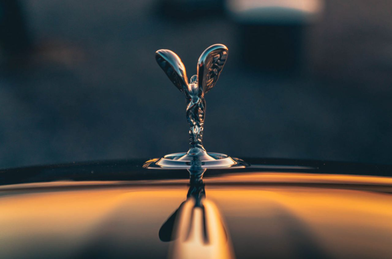
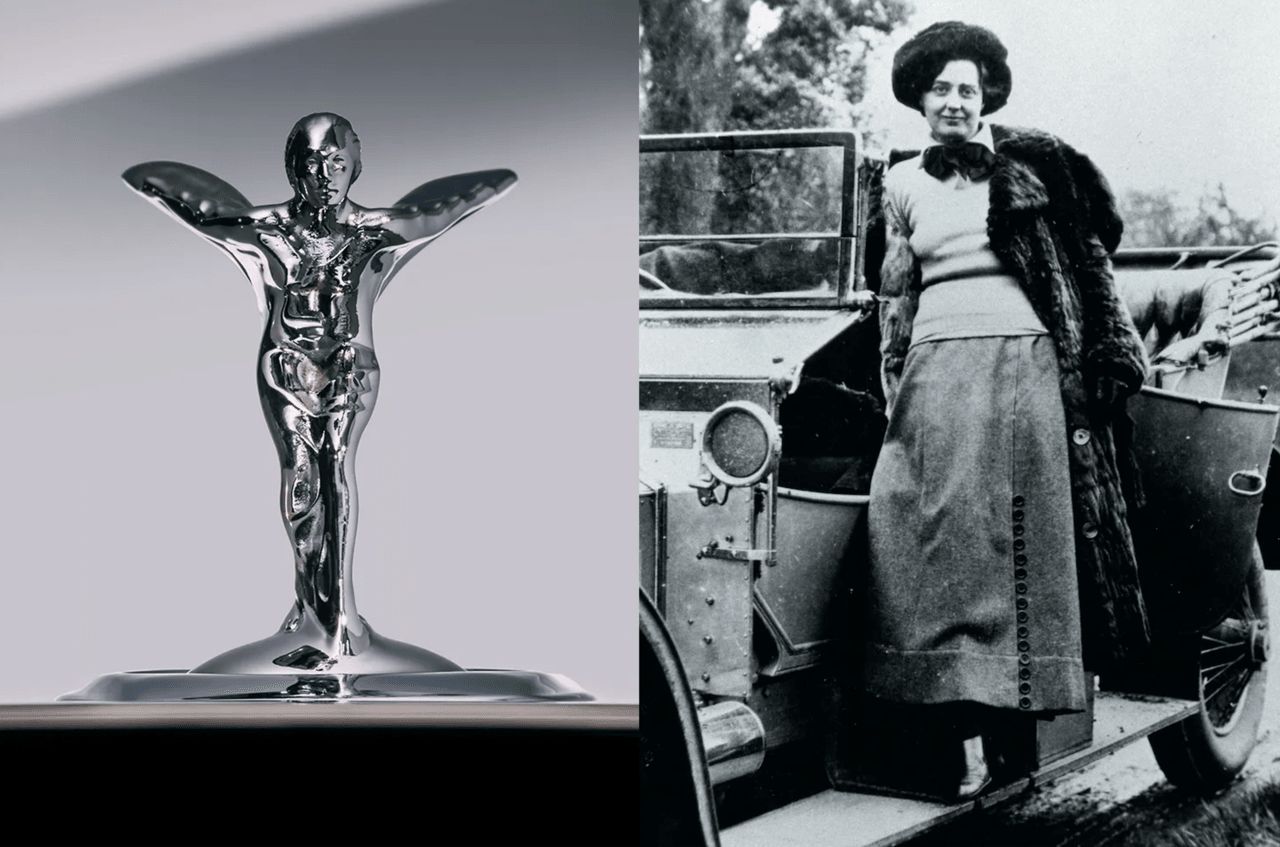
The Spirit of Ecstasy’s backstory carries a romantic note. Lord Montagu of Beaulieu commissioned Charles Robinson Sykes to create a personal mascot for his Rolls-Royce, using his secretary Eleanor Thornton as the model. The original sculpture, called “The Whisper,” depicted Eleanor with a finger to her lips, symbolizing a secret relationship. When Rolls-Royce officially adopted a mascot, Sykes revised the design into the Spirit of Ecstasy we know today. Modern versions can retract and feature advanced safety designs, yet the expensive emblem still requires expert care to keep every curve and detail sparkling clean.
Mercedes Benz & The Silver Arrow
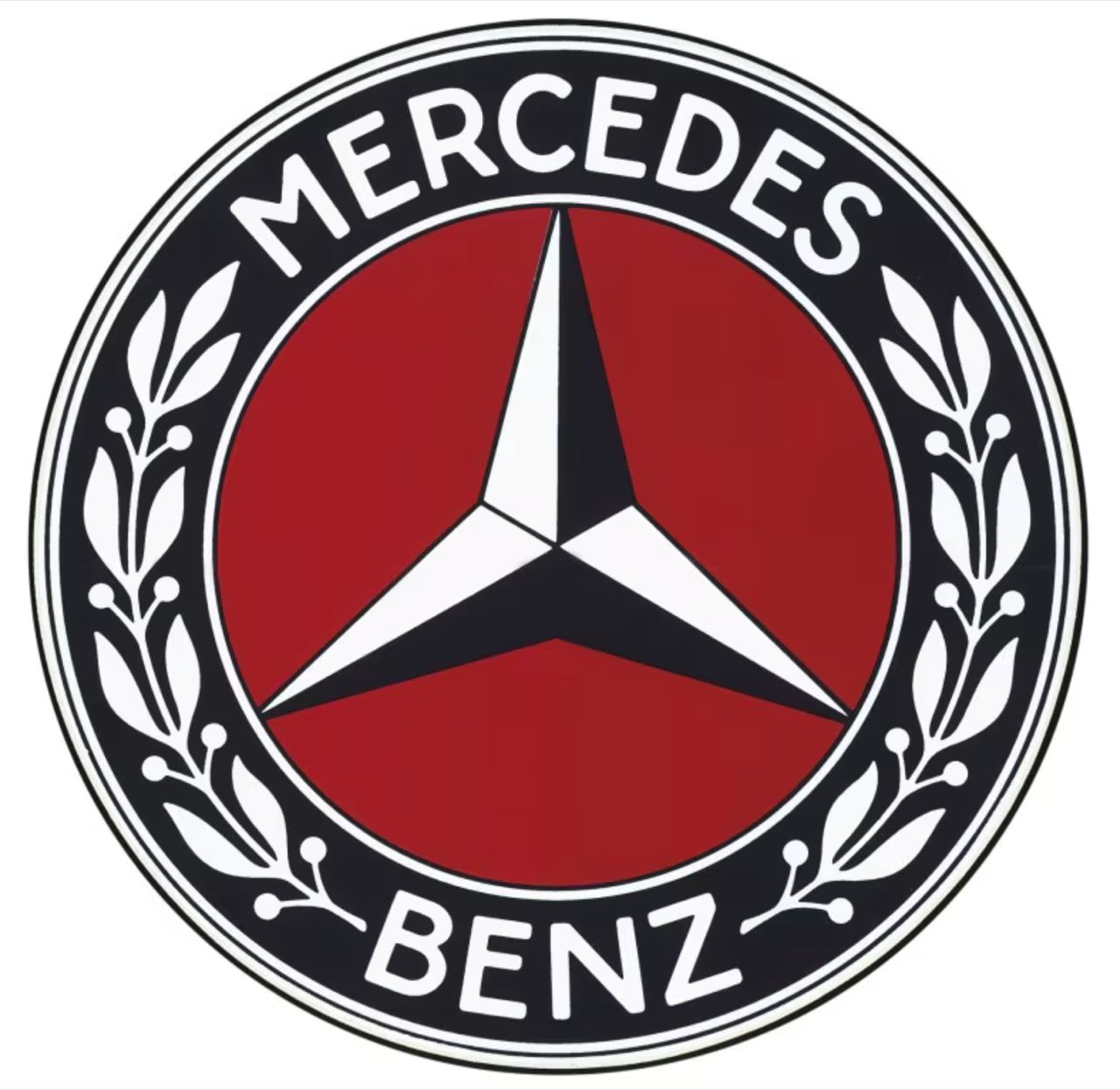
Mercedes-Benz’s three-pointed star is among the most recognized symbols in automotive history. The "Silver Arrow" story highlights the racing heritage behind the star emblem.
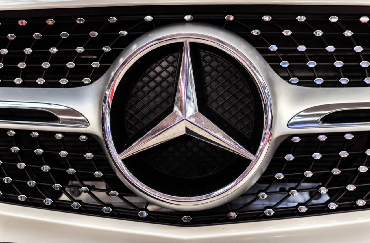
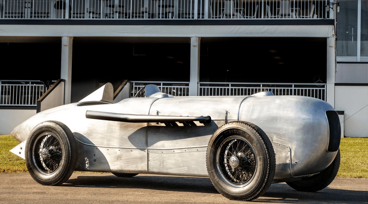
Designed by Gottlieb Daimler in the 1880s, the three-pointed star represented Mercedes-Benz’s ambition to dominate land, sea, and air transport. Daimler sketched the symbol on a postcard to his wife, inscribed with “One day this star will shine over our successful factory.” The Silver Arrow legend began at the 1934 Nürburgring Grand Prix when Mercedes cars exceeded weight limits by one kilogram. To shed weight, the racing team stripped white paint from the car bodies, revealing shiny aluminum metal. This natural silver finish not only solved the weight issue but became the iconic Silver Arrow color of Mercedes racing cars.
The racing heritage explains why today’s Mercedes-Benz owners strive to keep the three-pointed star emblem polished and pristine. Some owners use special ceramic coatings to protect the chrome surface and maintain a mirror-like shine reminiscent of the original Silver Arrows race cars.
Ferrari: The Prancing Horse
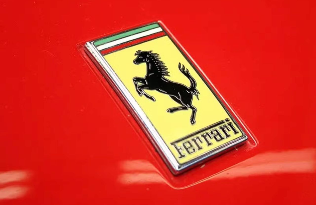
Ferrari’s black prancing horse logo is among the most meaningful in automotive history. The black horse on a yellow background tells a story of war, loss, honor, and acclaim, deeply tied to Italian culture. Originally, it belonged to Count Francesco Baracca, Italy’s top fighter pilot during World War I. Baracca painted the prancing horse on his plane, which brought him 34 aerial victories. After Baracca was shot down and killed in 1918, he became a national hero.
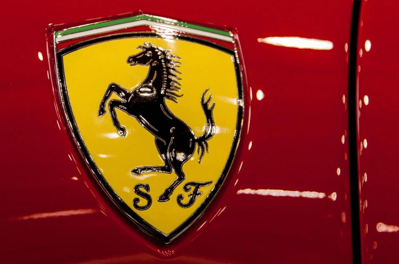
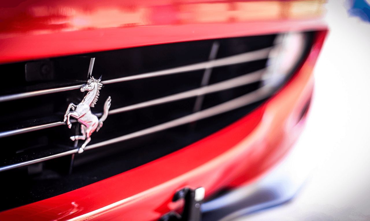
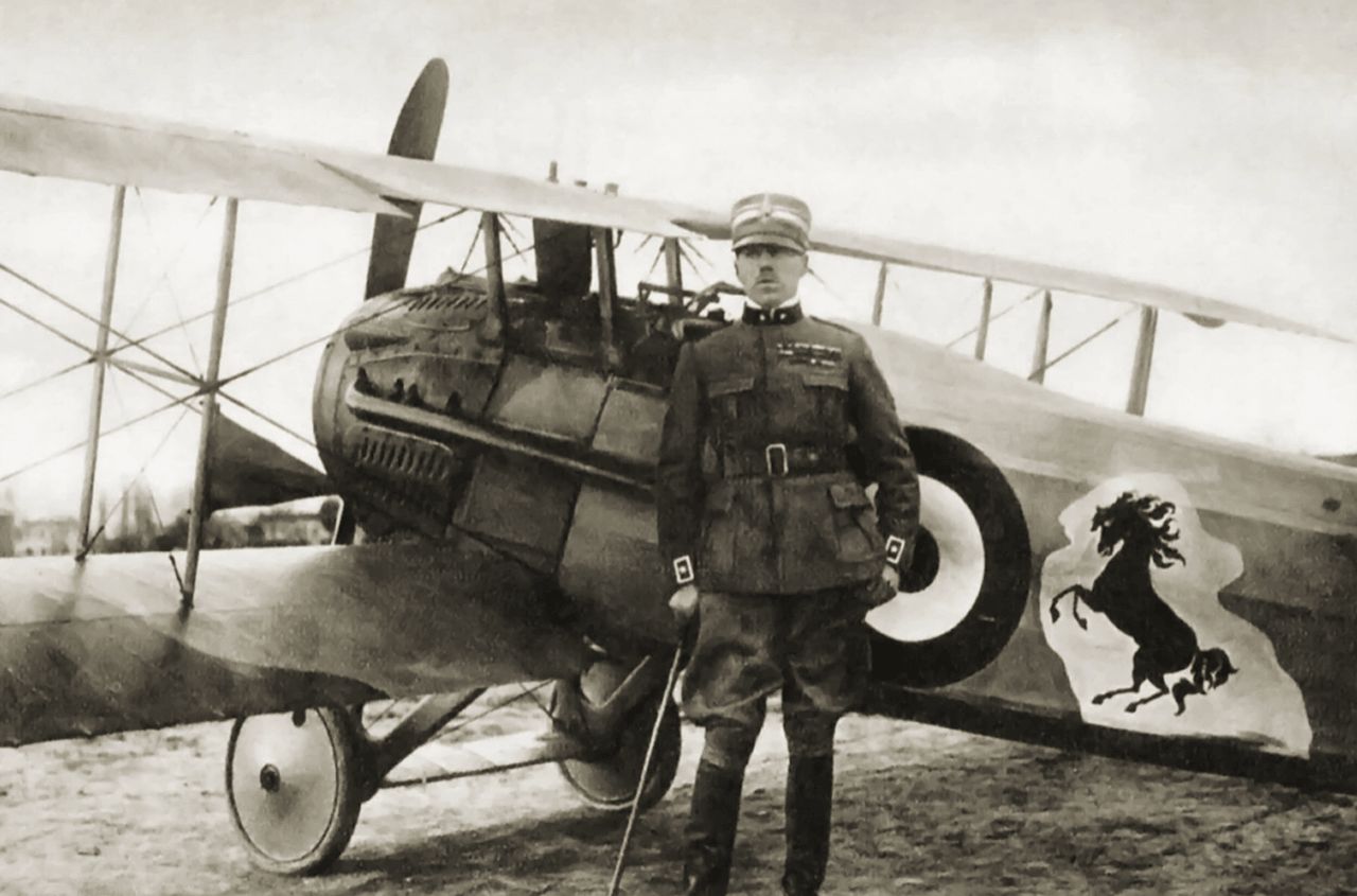
Years later, in 1923, Enzo Ferrari met Countess Parina, Baracca’s mother, at a race. She suggested he use her son’s horse emblem on his cars, promising it would bring luck. Enzo adopted the black horse but changed the background to yellow—the color of Modena, Ferrari’s hometown. He first used the emblem in 1932 on Scuderia Ferrari race cars and in 1947 on production vehicles sold worldwide. The logo’s connection to Italy’s military history and Roman pride makes Ferrari’s horse more than just a supercar logo—it symbolizes speed, victory, and Italian national pride.
Lamborghini: The Bull
Lamborghini’s bull emblem is both personal and astrological. Founder Ferruccio Lamborghini was born under the Taurus zodiac sign, symbolized by a bull. But the story goes beyond astrology. Lamborghini was a passionate fan of Spanish bullfighting and owned a bull farm. The bull’s powerful, aggressive stance perfectly represents the traits Ferruccio wanted in his cars: strength, ferocity, determination, and an unyielding fighting spirit.
The brand’s history is marked by rivalry and the desire to triumph, reflecting the competition between Lamborghini and Ferrari. While Ferrari’s horse conveys elegance and speed, Lamborghini’s bull symbolizes power and resilience. Their rivalry began when Ferruccio, a wealthy tractor manufacturer, complained to Enzo Ferrari about clutch problems in his Ferrari 250 GT. Enzo dismissed him, telling him to stick to tractors rather than criticize his cars. Offended, Ferruccio set out to build sports cars to compete with Ferrari.
Lamborghini’s bull emblem has changed little since the company’s founding in 1963. Many of Lamborghini’s most famous models are named after famous fighting bull breeds, such as Miura, Gallardo, and Huracán.
BMW: The Bavarian Roundel and a Common Misconception
BMW’s blue-and-white roundel is one of the most misunderstood logos in automotive history. Many believe it depicts a spinning airplane propeller, but this is a myth passed down for decades about the German aircraft engine and motorcycle manufacturer. In reality, BMW’s logo derives from the flag of Bavaria, Germany—the state where BMW was founded. The blue and white quadrants come directly from Bavaria’s flag, with the black outer ring taken from Rapp Motorenwerke, BMW’s predecessor, which made aircraft engines over 100 years ago.
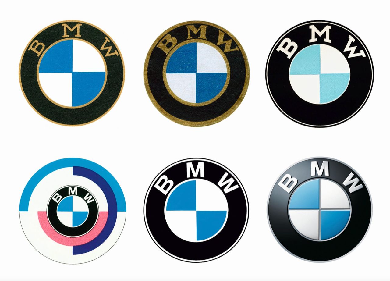
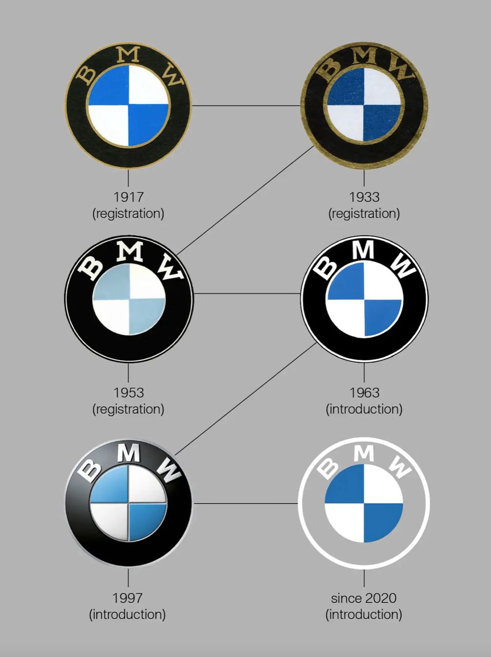
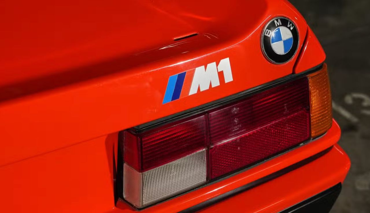
The propeller myth began in 1929 when BMW used an advertisement showing its logo overlaid on a spinning propeller to highlight its aircraft engine business. This unintentionally created the misconception that the logo itself was a propeller. BMW has clarified this multiple times, but the legend persists. The logo has remained remarkably consistent throughout BMW’s history, with only slight changes in lettering and proportions. Its simple, geometric design makes the blue-and-white roundel one of the most enduring symbols in automotive history.
Audi: Four Rings, Four Histories
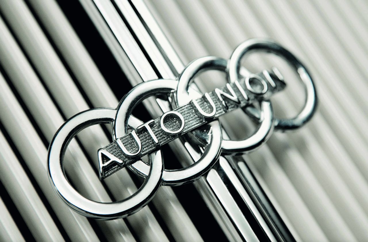
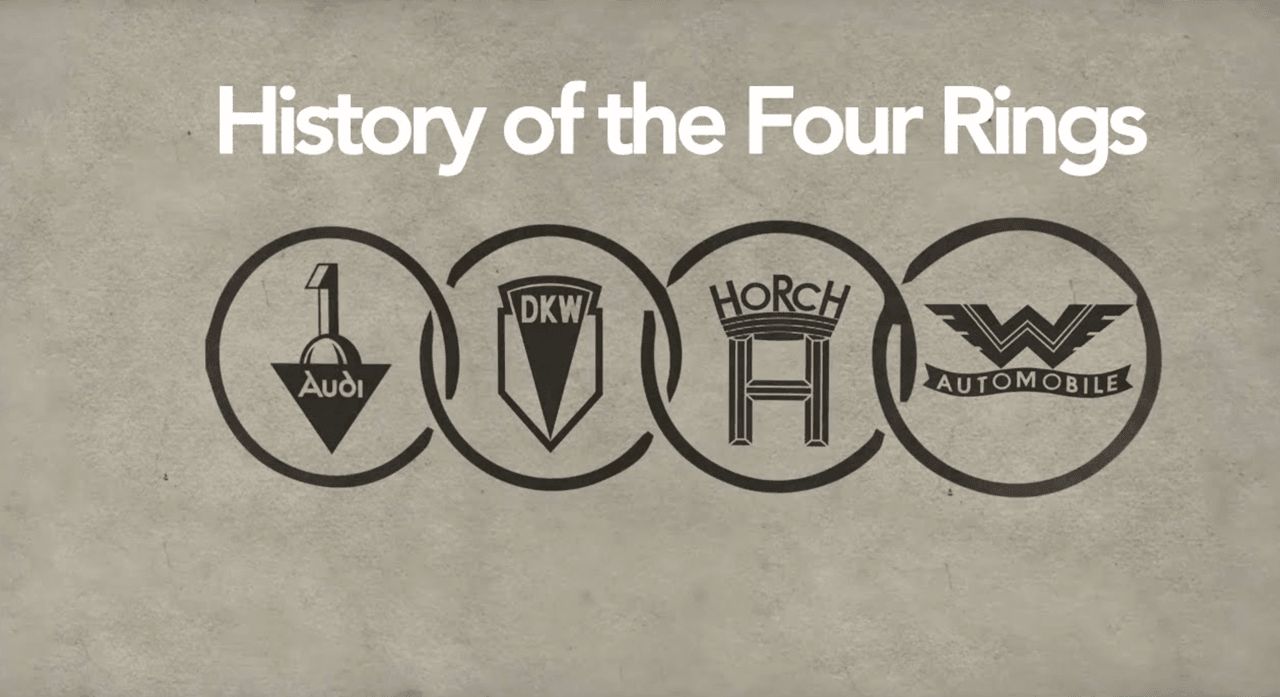
Audi’s four interlinked rings symbolize unity and collaboration in Germany’s automotive industry. Each ring represents one of four companies—Audi, DKW, Horch, and Wanderer—that merged in 1932 to form Auto Union AG. This merger was a response to Germany’s severe economic crisis, combining resources and expertise to create one of the country’s most successful automotive groups. The linked rings stand for strength through unity—while each company faced challenges alone, together they thrived.
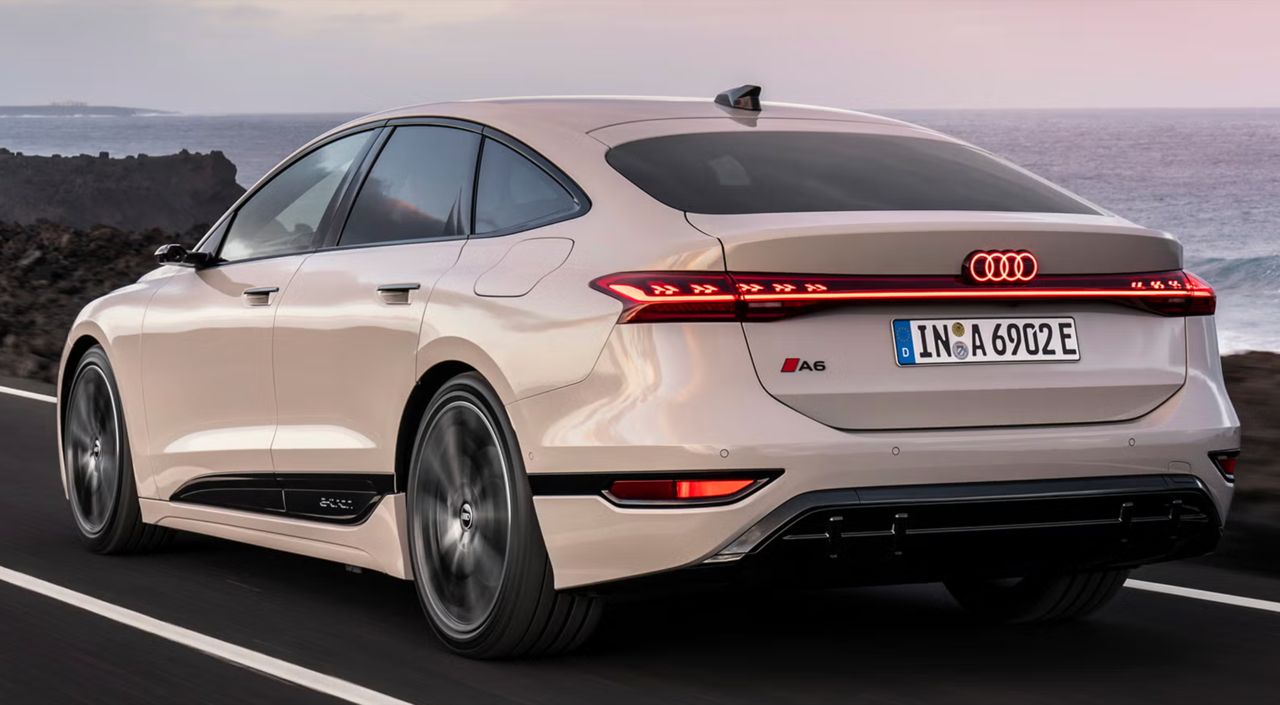
August Horch founded both Horch and later Audi after legal disputes forced him out of the original company. DKW began producing bicycles before expanding to motorcycles and cars. Wanderer also started with bicycles and motorcycles before entering the car market. Today, Audi is part of Volkswagen Group, but the four rings remain a symbol of the cooperative spirit driving the company’s success. The logo’s simple, modern design suits Audi’s luxury sedans and advanced electric vehicles, also representing the performance of the Quattro all-wheel-drive system.
Toyota: The Three Ellipses of Trust
Toyota’s three overlapping ellipses appear simple in the Japanese style but carry profound meaning about the philosophy and values of the global automotive giant. The inner ellipses form a stylized ‘T’ for Toyota, while the overlapping shapes represent the beneficial relationship between the company and its customers. The outer ellipse symbolizes Toyota’s global reach and the worldwide acceptance of Japan’s durable, reliable vehicles.
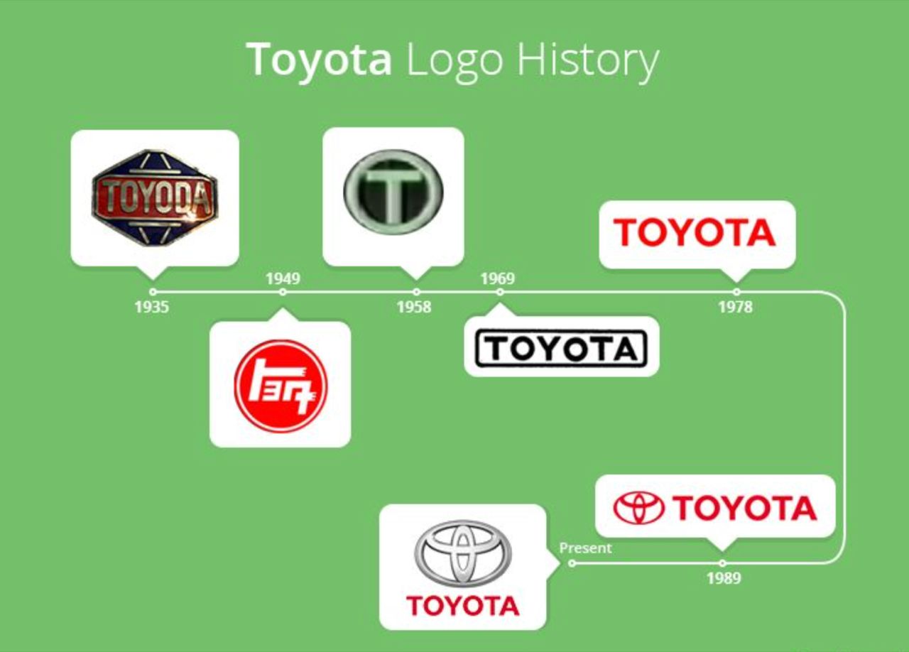
Additionally, the three ellipses subtly connect to Toyota’s history as a Japanese textile manufacturer. Some interpret the inner ellipse as a needle threading through fabric, referencing Toyota’s origins in automatic loom production. The logo’s brushstroke design reflects traditional Japanese calligraphy, with varying line thickness embodying classical art principles. Even the white space around the logo signifies Toyota’s core values: quality, innovation, integrity, and social responsibility.
Tesla: The Electric Revolution
Tesla’s logo symbolizes the modern automotive industry. Clean and simple, it deeply connects to the technology behind electric vehicles, energy management, autonomous driving, and minimalist interiors. Many mistakenly think the letter ‘T’ simply stands for Tesla, but its meaning is more complex.
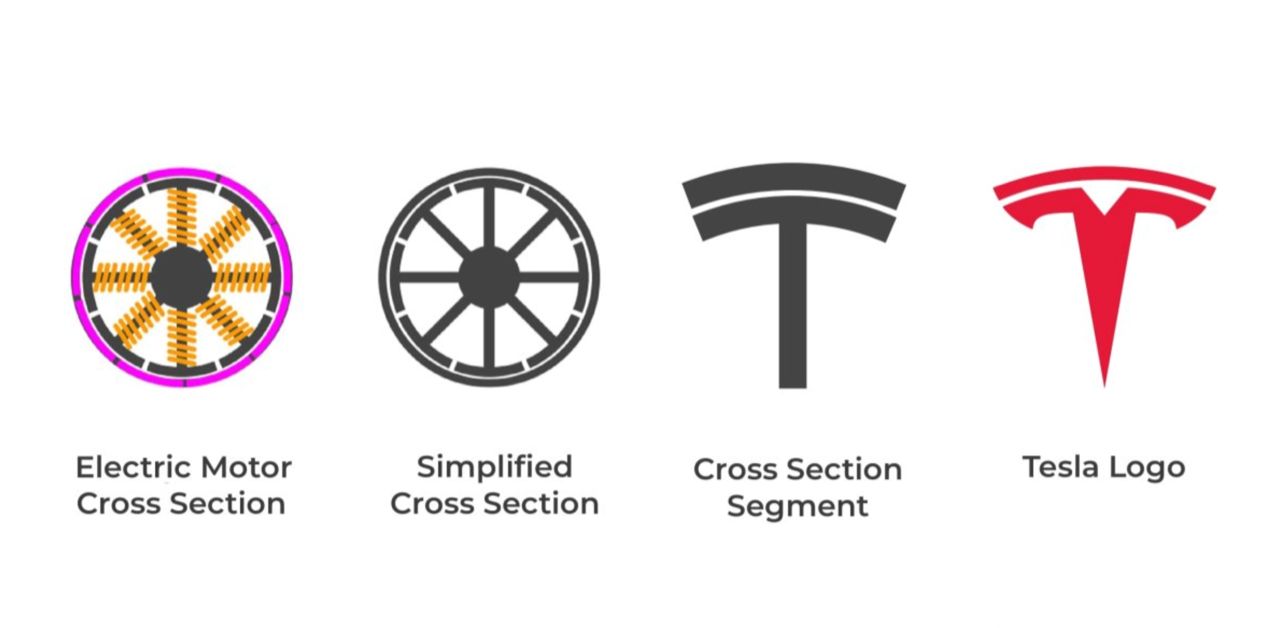
Elon Musk revealed the logo is a cross-section of an electric motor, inspired by Nikola Tesla’s original alternating current (AC) motor design. The curved top represents the stator (stationary part), while the vertical line depicts the rotor (rotating part). This technical inspiration reflects Tesla’s design philosophy where every element has purpose and form aligns with function. The logo’s simplicity suits digital platforms—on car hoods, smartphone screens, or websites—and represents the future of automotive branding by moving away from traditional emblems toward clean designs emphasizing clean energy technology, appealing to younger customers.
Porsche: The Stuttgart Shield
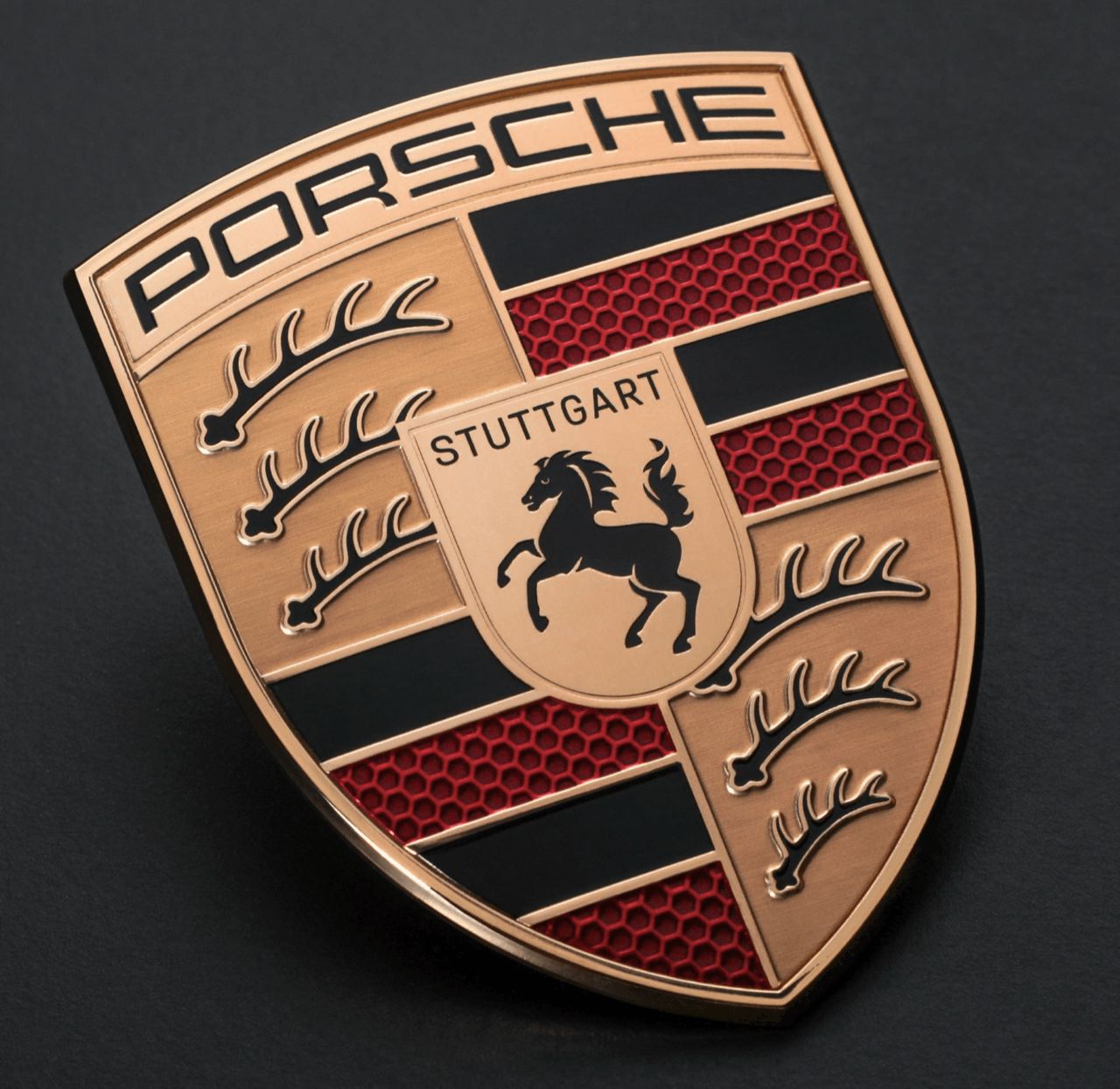
Porsche’s logo is a masterful emblem design honoring the company’s roots in Stuttgart, Germany. It combines elements from Stuttgart and the state of Württemberg, producing a logo rich in pride and German historical significance. The black horse at the center symbolizes Stuttgart, whose name derives from “Stutengarten,” meaning “mare’s stud farm.” The city was originally founded as a horse breeding farm in the early 10th century. The red and black stripes with antlers represent the coat of arms of Württemberg, the former German state where Stuttgart is located.
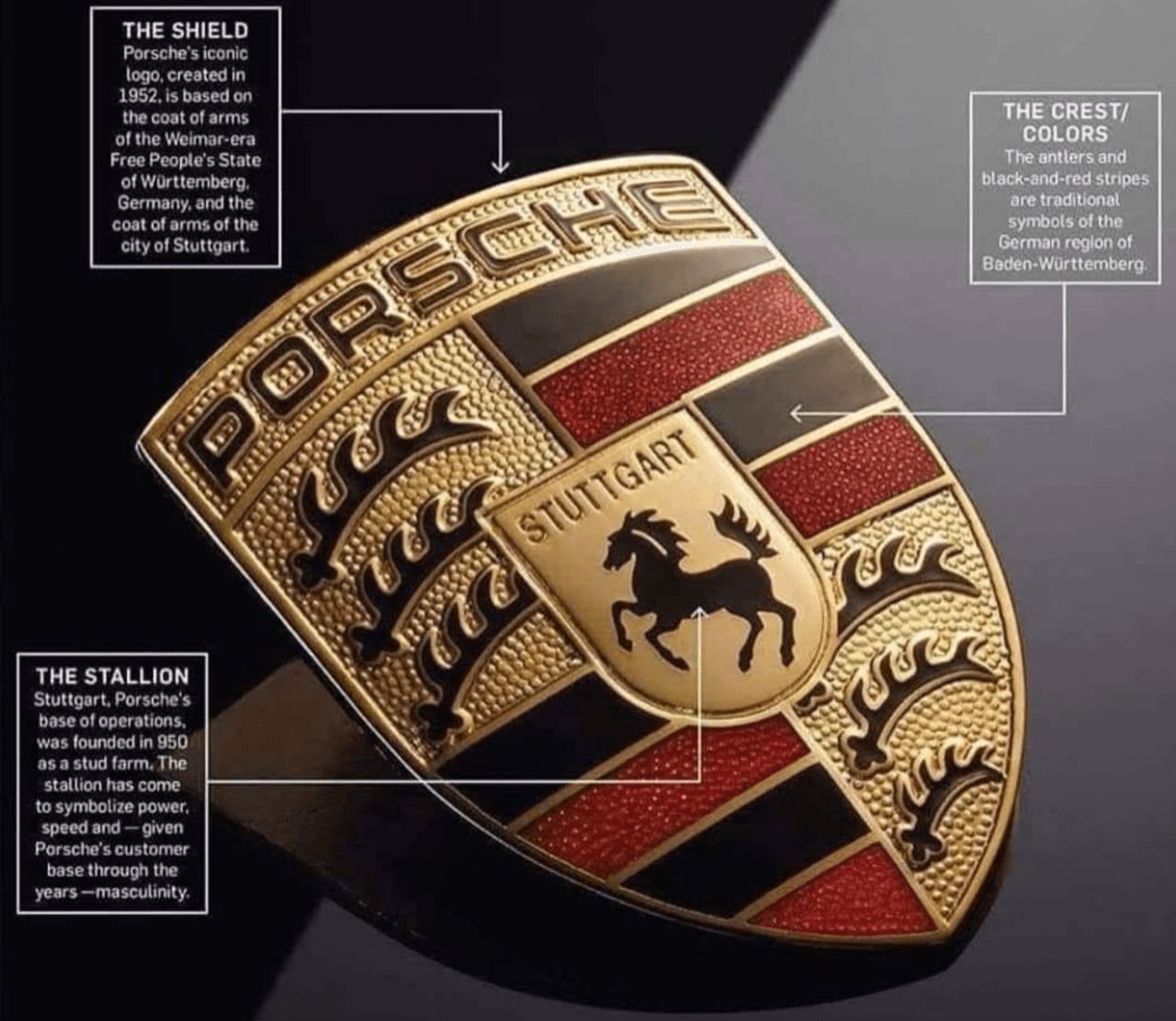
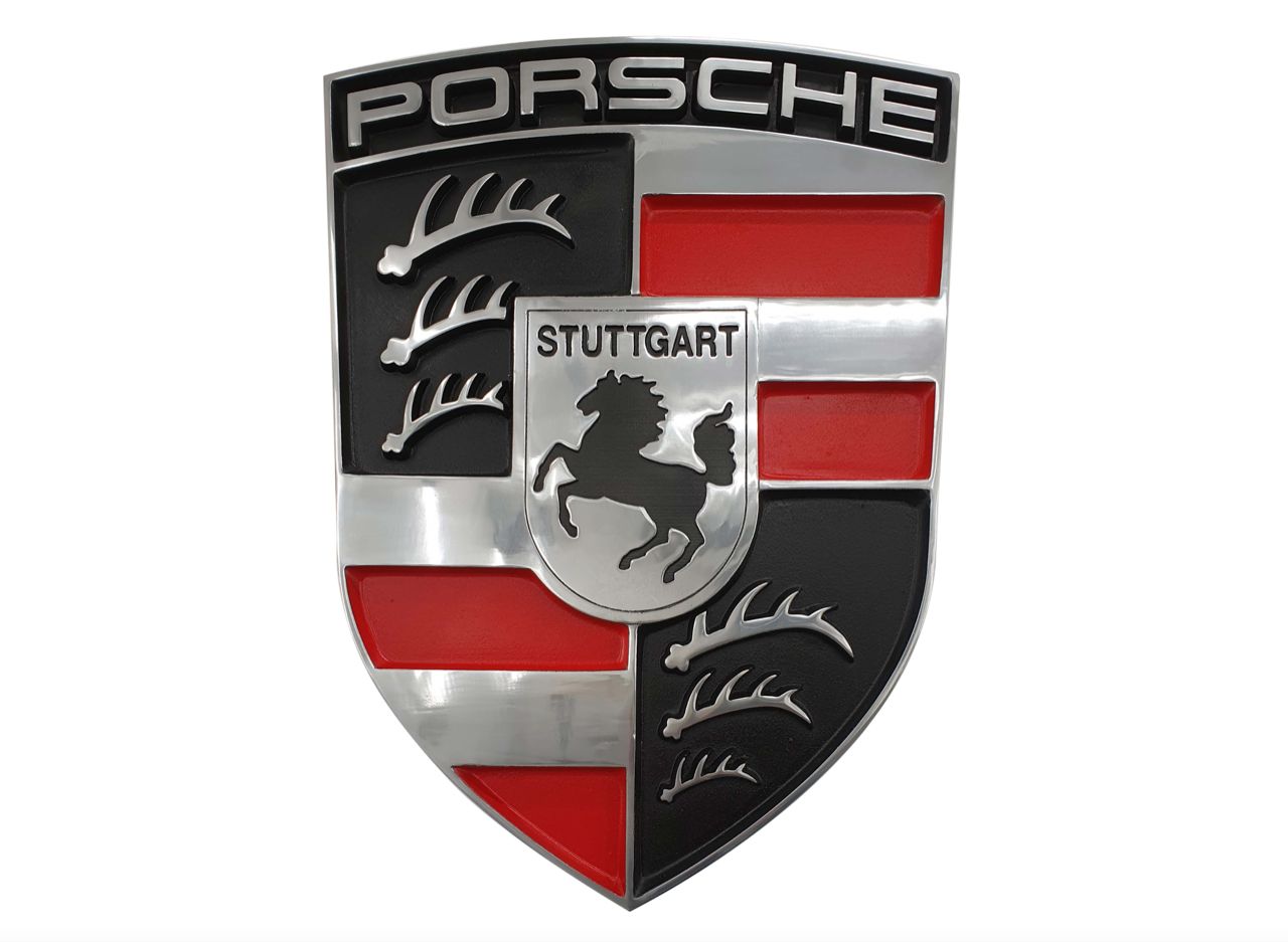
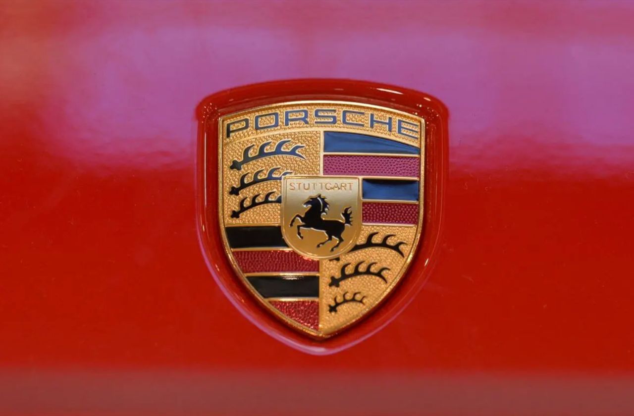
Franz Xaver Reimspiess designed the logo in 1952, and it has remained largely unchanged since. The only update came in 2023 when Porsche launched a 3D version of the emblem, adding depth and modernity while preserving classic design elements. Marking Porsche’s 75th anniversary, the refreshed logo features simplified lettering, enhanced dimensionality, and a honeycomb pattern in the red sections. This updated emblem debuted on the 2023 Porsche Panamera.
The logo perfectly reflects Porsche’s identity, rooted in German tradition yet forward-looking. The horse symbolizes power and elegance—qualities embodied by every Porsche, past and present.